



















HomeAbout
Case StudiesPricingBlogs & Article
First State Fleet Service Bespoke Website Design by 360 Web Coders
Florecitadocker Bespoke Website Design by 360 Web Coders
Frame 1 Bespoke Website Design by 360 Web Coders
Heat Shield Bespoke Website Design by 360 Web Coders
Lane's Bespoke Website Design by 360 Web Coders
LeChefLeon Bespoke Website Design by 360 Web Coders
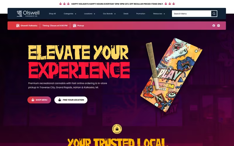
Olswell Cannabis Co Bespoke Website Design by 360 Web Coders
peakphorm Bespoke Website Design by 360 Web Coders
Phantom Films Bespoke Website Design by 360 Web Coders
Redfin Blues Bespoke Website Design by 360 Web Coders
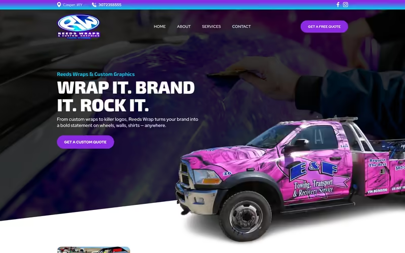
Reeds Wrap Bespoke Website Design by 360 Web Coders
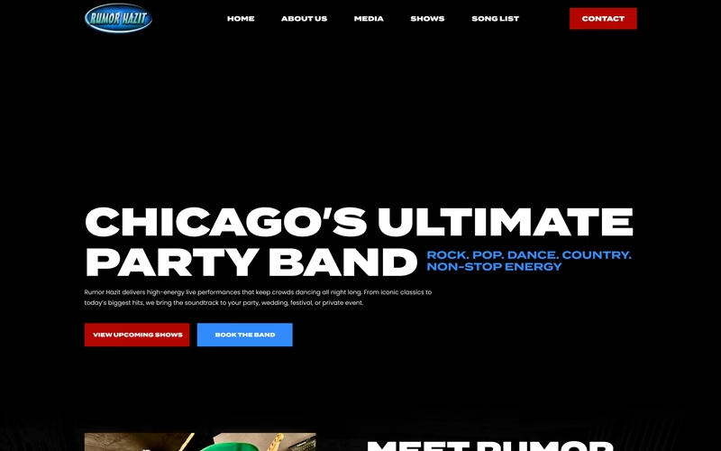
Rumor Hazit Bespoke Website Design by 360 Web Coders
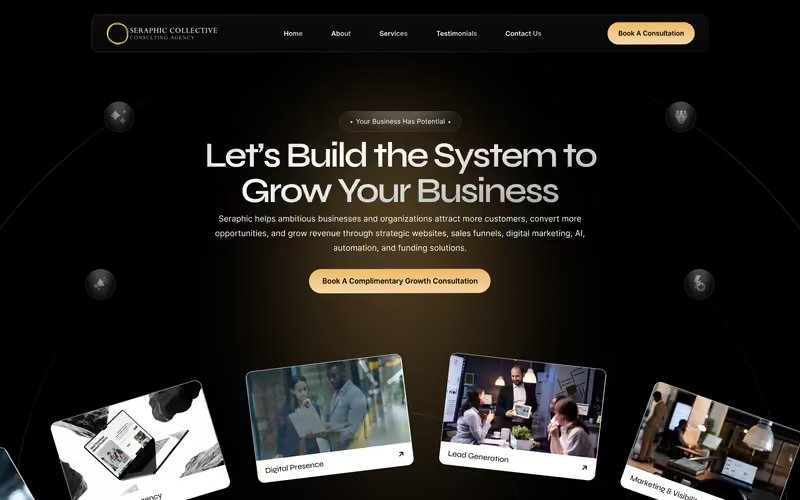
seraphic collective Bespoke Website Design by 360 Web Coders
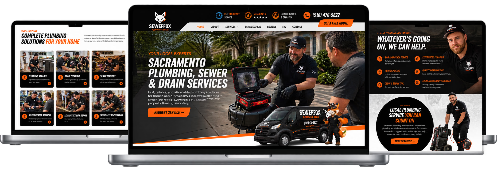
SewerForx Bespoke Website Design by 360 Web Coders
Toys Car Audio Bespoke Website Design by 360 Web Coders
Velvet Voice Narration Bespoke Website Design by 360 Web Coders
AAC Bespoke Website Design by 360 Web Coders
Buyer vision Media Bespoke Website Design by 360 Web Coders
Carriage Tours of Savannah Bespoke Website Design by 360 Web Coders
Cendant stem cell center Bespoke Website Design by 360 Web Coders
elisen Bespoke Website Design by 360 Web Coders
Carriage Tours of Savannah Bespoke Website Design by 360 Web Coders
Cendant stem cell center Bespoke Website Design by 360 Web Coders
elisen Bespoke Website Design by 360 Web Coders
Carriage Tours of Savannah Bespoke Website Design by 360 Web Coders
Cendant stem cell center Bespoke Website Design by 360 Web Coders
elisen Bespoke Website Design by 360 Web Coders
Carriage Tours of Savannah Bespoke Website Design by 360 Web Coders
Cendant stem cell center Bespoke Website Design by 360 Web Coders
elisen Bespoke Website Design by 360 Web Coders

Responsive Web
Design For
UK Mobile

Our Responsive Web Design UK specialists engineer mobile-first websites, fluid CSS grid layouts, and thumb-friendly interfaces that convert smartphone, tablet, and desktop visitors with sub-second speed.

Request A Proposal
Select a Service
What Happens Next?
Complete Form
Free Consultation
Get Proposal
0%

Multi-Device Viewport Precision

0s

Average 4G Mobile Load Speed

0%

Mobile Enquiry Uplift

0%

Google Mobile-Friendly Score

Service Overview

Over two-thirds of British consumers and B2B decision-makers now browse, compare, and enquire on smartphones first. If your website suffers from cramped tap targets, horizontal scrolling, or sluggish mobile load times, you are losing daily revenue to faster competitors. At 360 Web Coders in Wallington, Surrey, our Responsive Web Design UK service applies strict mobile-first engineering from day one. We design fluid breakpoints in Figma for compact iPhones, Samsung Galaxy devices, iPads, laptops, and ultra-wide 4K monitors alike. Every responsive layout features ergonomic thumb-zone navigation, adaptive typography scales, next-gen WebP/AVIF imagery, WCAG 2.2 AA touch accessibility, UK GDPR-compliant mobile banners, and green Google Core Web Vitals metrics (LCP, INP, and CLS) that boost both mobile rankings and conversion rates.

Service Overview - Mobile Image 1
Service Overview - Mobile Image 2
Service Overview - Mobile Image 3
WHAT WE OFFER

Mobile-First Responsive
Solutions We Deliver

We engineer adaptive layouts that feel like native mobile apps on smartphones while delivering expansive visual storytelling on widescreen desktop displays.

Upgrade Your Mobile Website arrow_forward
smartphone

Thumb-Zone Navigation

Sticky mobile action bars, accessible hamburger drawers, and 48px minimum tap targets engineered for effortless one-handed smartphone browsing.

aspect_ratio

Fluid Grid Breakpoints

Precision layouts utilizing modern CSS Grid, Flexbox, and container queries that adapt smoothly across every screen width from 320px to 2560px.

bolt

Core Web Vitals Speed

Responsive image srcset delivery, zero layout shift (CLS), and fast Interaction to Next Paint (INP) over UK 4G and 5G mobile networks.

accessibility_new

WCAG 2.2 Touch Compliance

High-contrast mobile typography, pinch-to-zoom support, and screen-reader friendly semantic structures compliant with UK Equality Act standards.

Our Responsive Design Process

A mobile-first 6-step workflow that prioritizes smartphone usability and conversion speed before expanding progressively to tablet and desktop viewports.

01 Discover

We analyze your UK Google Analytics device split, mobile bounce rates, and smartphone conversion bottlenecks across iOS and Android users.

Discover
Discover
Discover
Discover
02 Wireframe

We draft mobile-first wireframes first, ensuring primary value propositions, trust signals, and call-to-action buttons sit within natural thumb reach.

Wireframe
Wireframe
Wireframe
Wireframe
03 Design

We create synchronized Figma screens across mobile (375px), tablet (768px), laptop (1440px), and 4K desktop breakpoints with fluid type scales.

Design
Design
Design
Design
04 Prototype

You test real interactive mobile and desktop Figma prototypes directly on your smartphone and computer to validate touch flows before coding.

Prototype
Prototype
Prototype
Prototype
05 Optimize

We verify layout stability, touch target spacing, and mobile PageSpeed scores across physical iPhones, iPads, and Android devices in our QA lab.

Optimize
Optimize
Optimize
Optimize
06 Launch

We deploy your responsive build with Google Search Console mobile usability verification and ongoing mobile conversion rate monitoring.

Launch
Launch
Launch
Launch

RESPONSIVE DESIGN STACK

SCROLL TO EXPLORE

FLUID LAYOUT & SPEED TOOLS

We combine Figma Auto-Layout constraints with Tailwind CSS, CSS Grid, Flexbox, BrowserStack physical device testing,
and Google Lighthouse Core Web Vitals optimization.

Explore All Services arrow_forward
TS
php
aws
S
S
Pricing Plans

Responsive Web Design Packages

Fixed-price UK packages for new mobile-first website builds or responsive retrofits of legacy desktop websites.

Loading pricing data...

UK & GLOBAL COVERAGE

Responsive Web Design Across the UK

Helping British businesses capture on-the-go mobile customers in London, Manchester, Birmingham, Leeds, Glasgow, and across the UK.

Losing mobile leads to slow or broken layouts? Talk to our UK responsive specialists.

Contact Us Today arrow_forward
RESPONSIVE DESIGN FAQ

Responsive Web Design UK Frequently Asked Questions

Straightforward answers on mobile-first web design costs in GBP, Core Web Vitals impact, and multi-device testing.

Responsive web design in the UK costs between £1,200 to £3,500 to retrofit or redesign an existing desktop site into a mobile-first experience, and £2,000 to £8,000 for a complete multi-device bespoke website build at 360 Web Coders.

Google uses mobile-first indexing across the UK, meaning it crawls and ranks the mobile version of your website first. A fast, responsive layout with strong Core Web Vitals directly improves your organic rankings and Google AI Overview visibility.

A responsive website redesign takes 2 to 4 weeks for multi-breakpoint Figma wireframing and UI design, or 3 to 6 weeks including full responsive frontend coding and real-device QA testing.

We design and test across 320px to 430px smartphones (iPhone SE, iPhone 15/16 Pro Max, Samsung Galaxy S24), 768px to 1024px tablets (iPad Air and iPad Pro), 1280px to 1440px laptops, and 1920px+ desktop monitors.

We implement adaptive AVIF and WebP image srcsets, critical inline CSS, system-optimized variable fonts, and zero-bloat scripts so mobile pages pass Google Core Web Vitals with LCP under 1.8 seconds.

Yes, you can contact our UK team at 129 Staford Rd, Wallington SM6 9BN or call +44 7587 722152 for a complimentary mobile usability and Core Web Vitals audit of your current website.

Want us to audit your current mobile website? Book a free design call →